This is as good a reason as any to test out the new plotting template I’ve been putting together for the site. The shooting plots used on the Moreyball leaderboard discussion are auto-generated, and I thought I’d expand that template out to other types of plots.
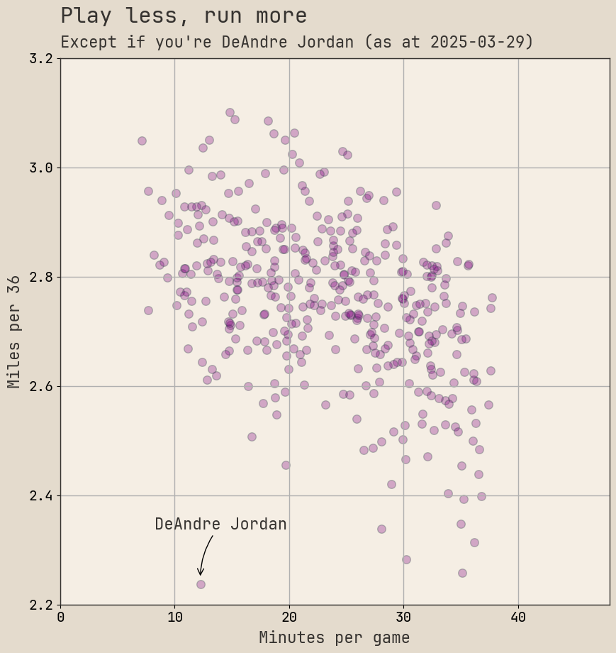
Below is a scatter plot of the relationship between minutes per game and miles run per 36. Obviously if you plot minutes per game against miles per game you get basically a straight line, but if you adjust for playing time you get a different trend.

In general, players that play less run more in the time they do have on the court. Which makes sense: they’re fresher, they’ve got more to prove, and they’re often role players who are running hard in the 10-20 minutes they get each night.
DeAndre Jordan is that dot in the bottom left corner. He barely moves in just under 12 minutes per game compared to a typical player with that amount of play time. He doesn’t qualify for the 500 minutes limit on the distance leaderboard, but I included him because he’s such an outlier. And because he’s played 485 minutes as of writing, which is close enough.
That other grouping in the bottom right are superstars and veterans, including James Harden, Chris Paul, and Joel Embiid. Also, weirdly, Jayson Tatum is in that mix — he runs marginally less than Chris Paul per 36 minutes, which feels weird for a guy who’s 13 years younger…